Bop


Social, local, mobile discovery

“bop allows you to see what your local community is up to. A digital interface that extends beyond friends and families, beyond “following” and being “followed,” that actually clues you in to all the fun events happening all around you, connecting you to your true community.

It’s visual twitter unchained from the closed network.”
– from the bop founders. 

The bop app was created with a small team looking to launch a new kind of local experience/event discovery app geared towards a college demographic. Users were given the ability to create private and public posts under a set of categories and tied to a location. Users had the ability to search and join local bops featured in their feed based on their location and college association.

Concepts included features such as a visual representation of day and weather changes, digital to physical product feature add ons (i.e. physical invitations), lightweight interactions, social interactions, private vs. public posting amongst others.

 
20160201bop_app_ui_flow.jpg
Screen Shot 2014-04-25 at 6.12.59 PM.png
Screen Shot 2014-04-25 at 6.13.16 PM.png
Screen Shot 2014-04-25 at 6.13.36 PM.png
 
 
20160201bop_flow1.jpg
 
20160201bop_app_ui__profile_flow.jpg
20190711bop.jpg
bop_24_hour2 (Converted).gif
scroll_gifs.gif
like2.gif

The future of medical billing


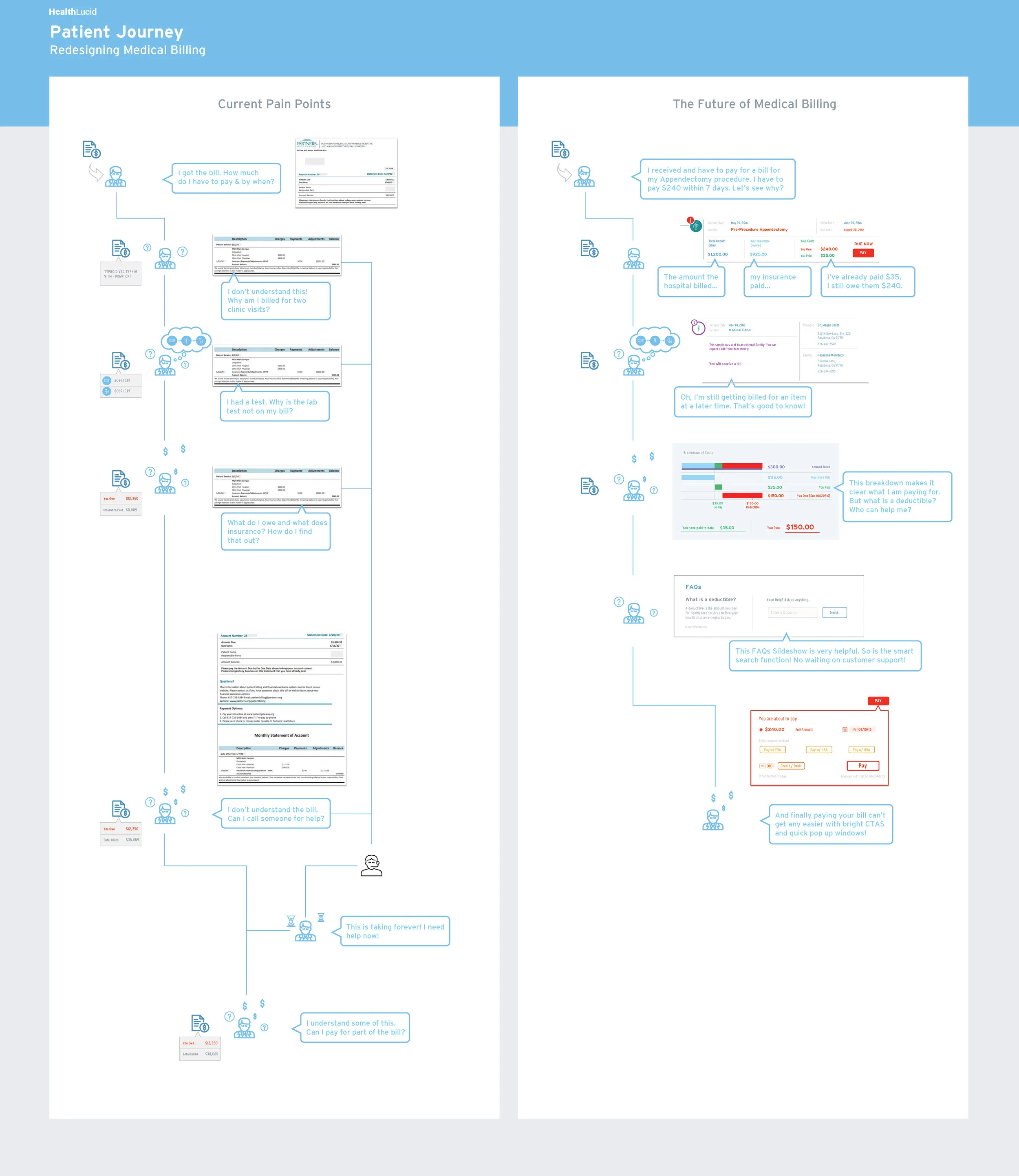
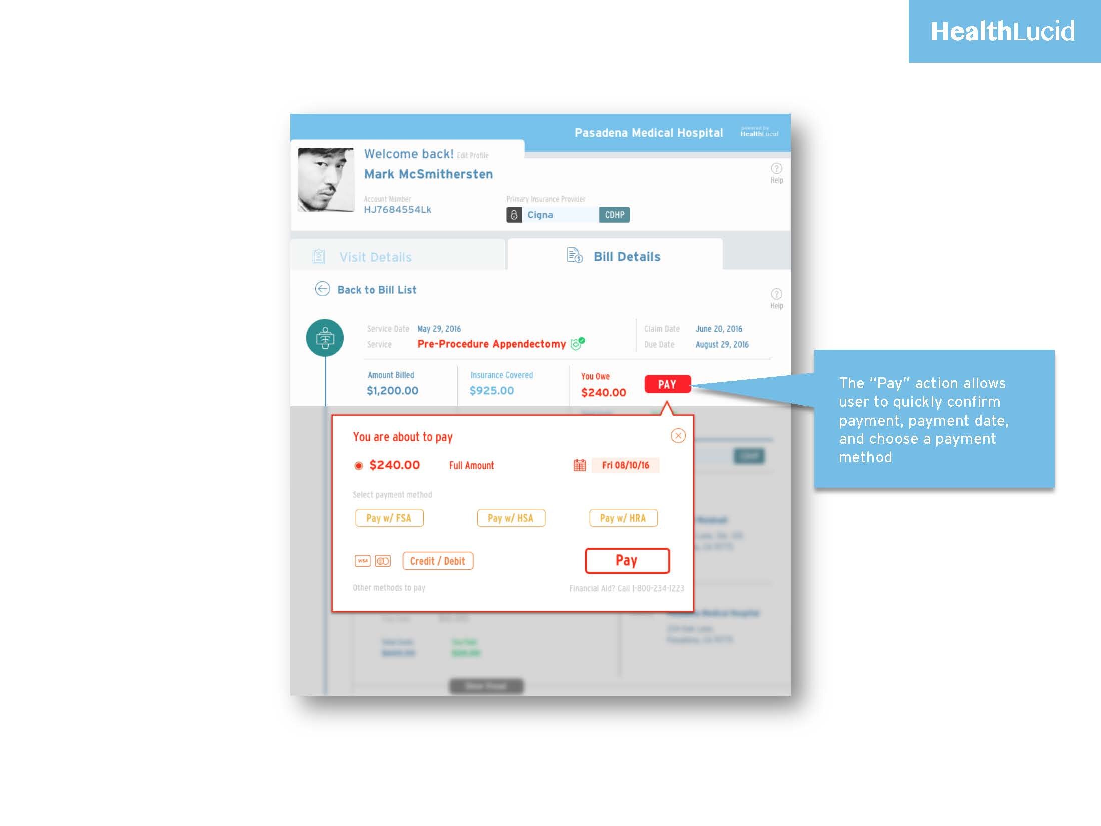
I took part in a week long, two part hackathon challenge looking to disrupt the medical billing world by simplifying the user experience of current medical billing processes. Our small team of five worked remotely to create the UX/Ui to alleviate costs for employers providing health benefits, and to empower users to understand their care costs during various stages of their billing cycles.
 
1_User Journey HL2.jpg
 

Screens

The healthcare system along with medical billing are one of this country’s most complex processes resulting in a lot of financial headache and misunderstanding.

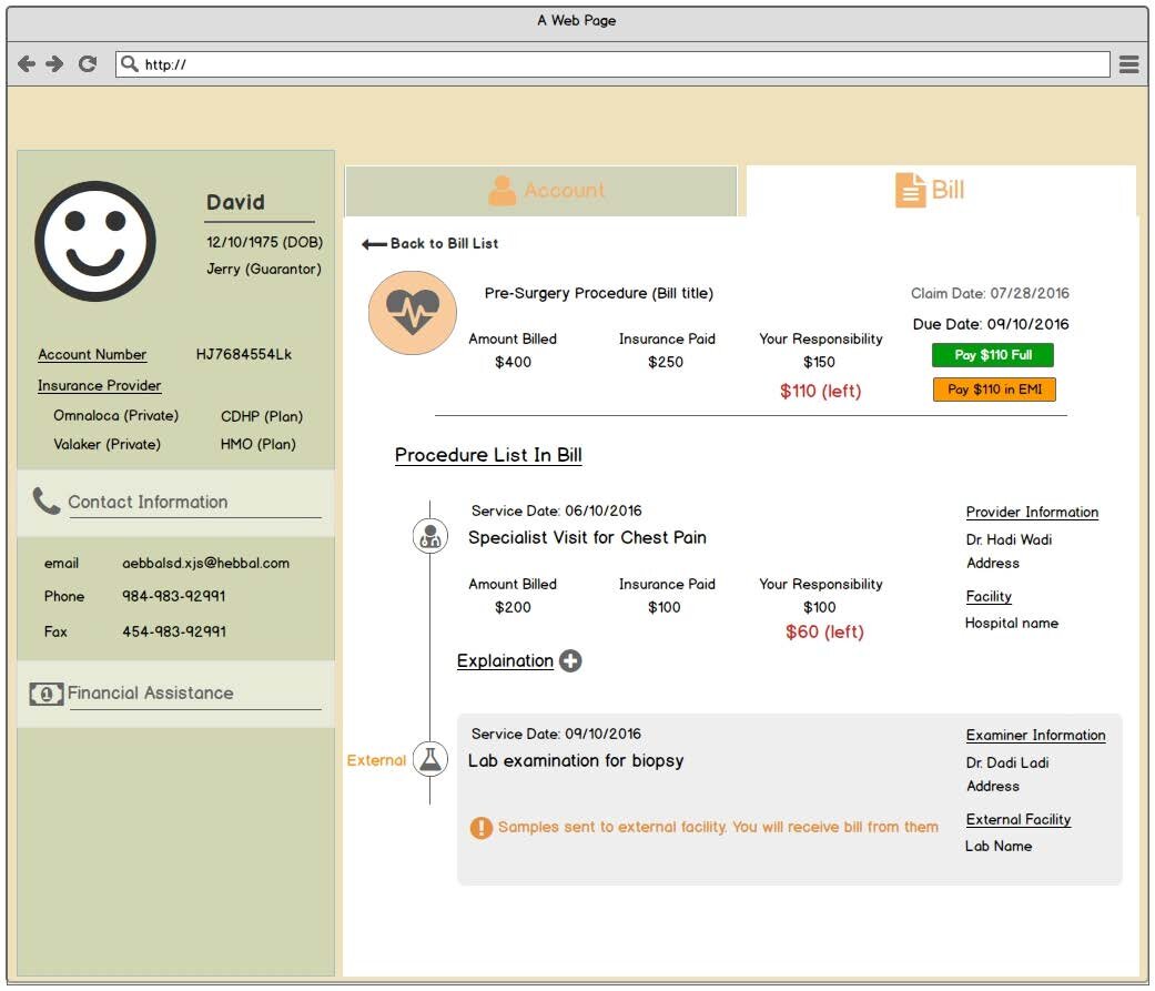
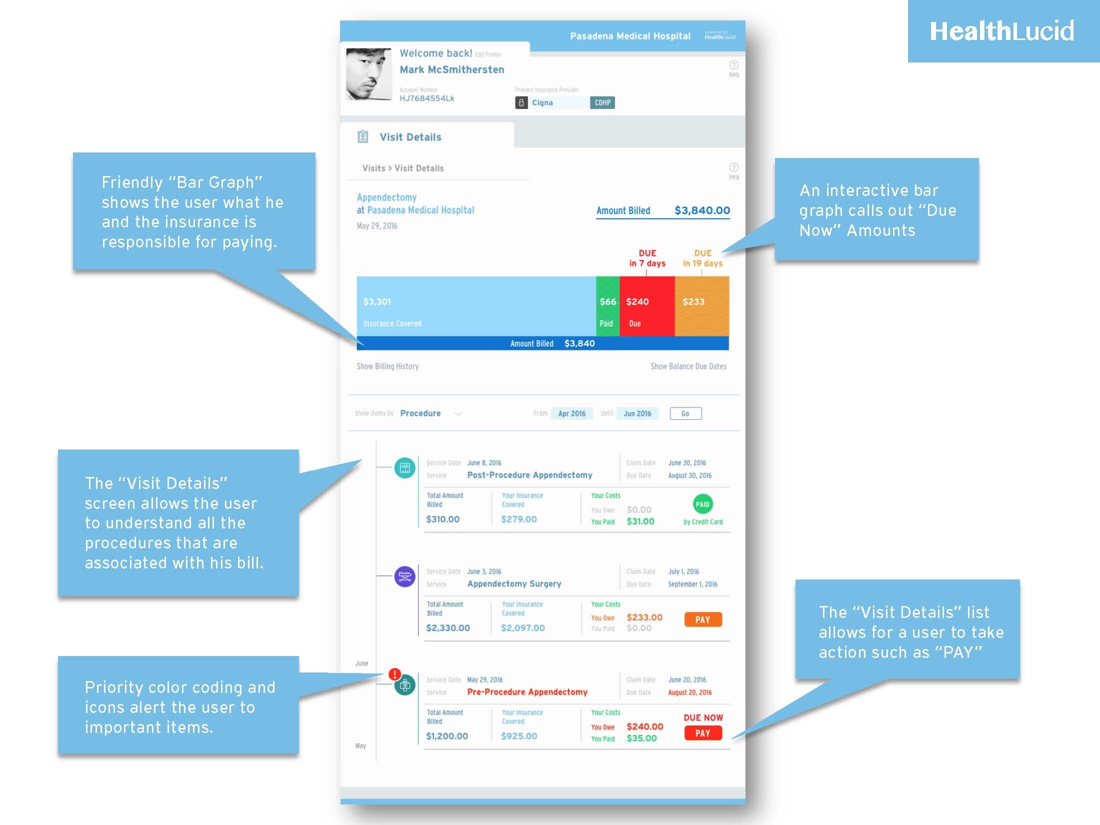
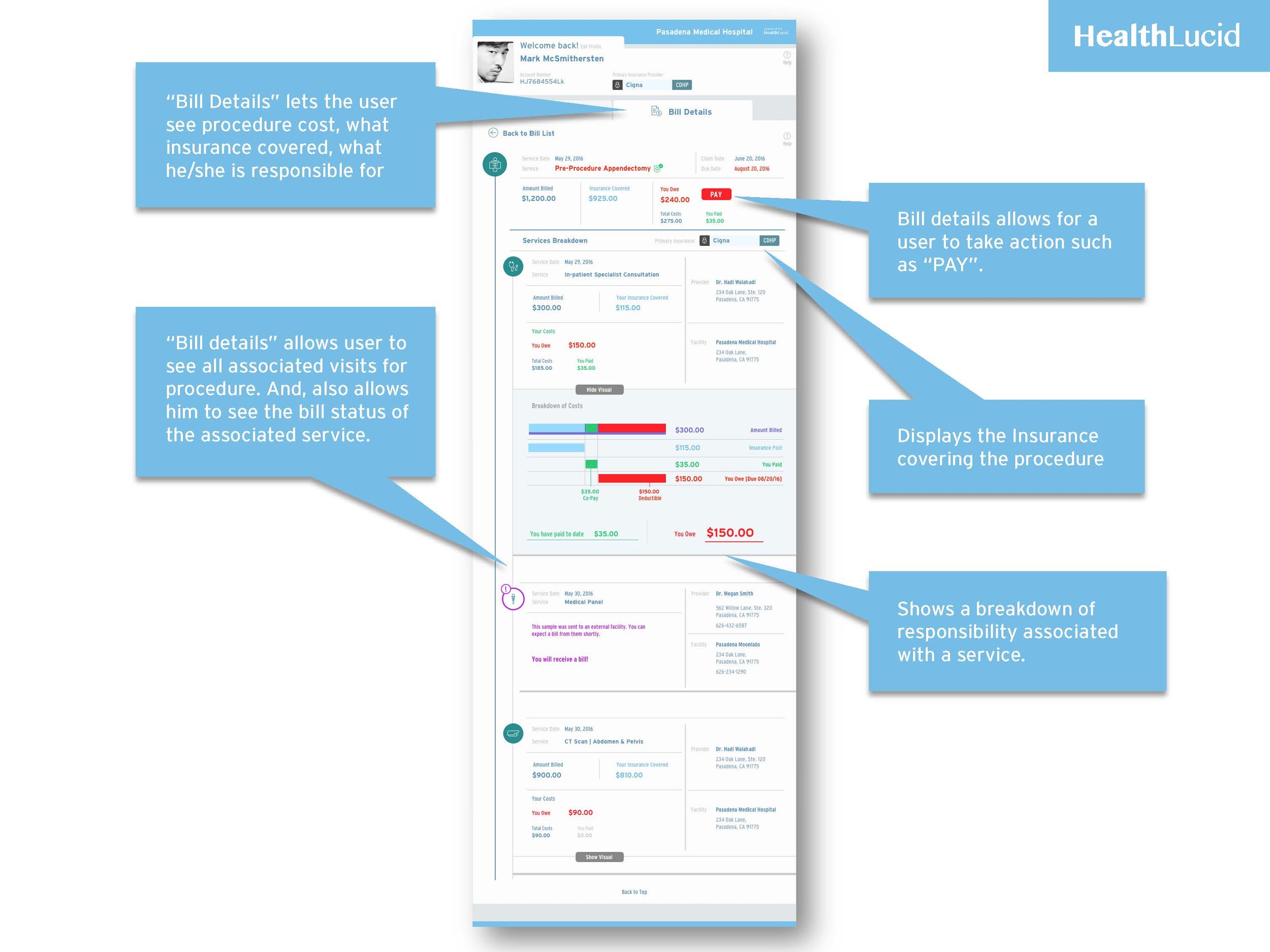
This hackathon involved working with a remote team over the next 7 days resulted in breaking down, defining and understanding the current issues of today’s outdated and complex medical billing workflows. We created a consumer facing medical dashboard, user flows, brand identity update, and iteration of an interactive medical bill breakdown.


hl-onscroll.png
 

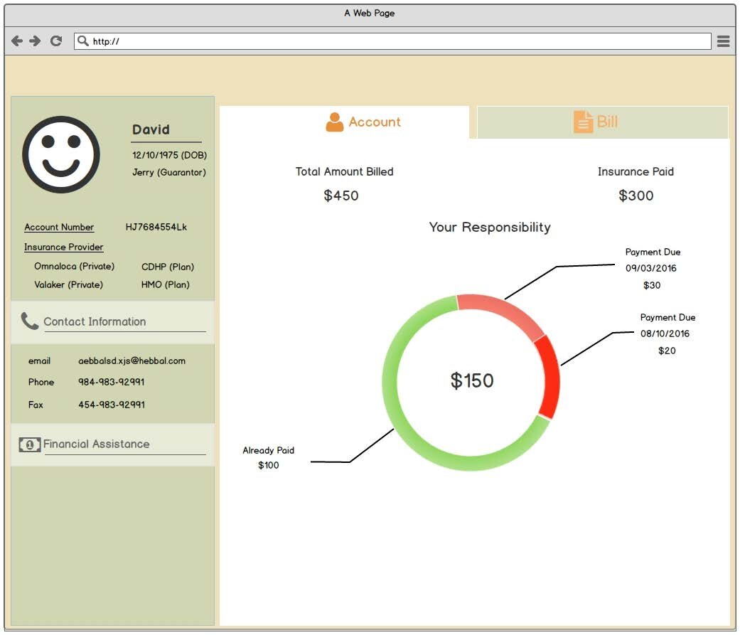
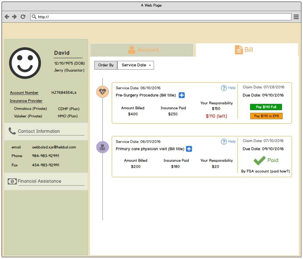
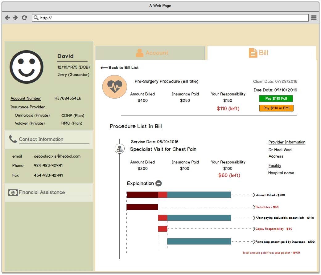
Balsamiq wires


Brand application example

Brand application example


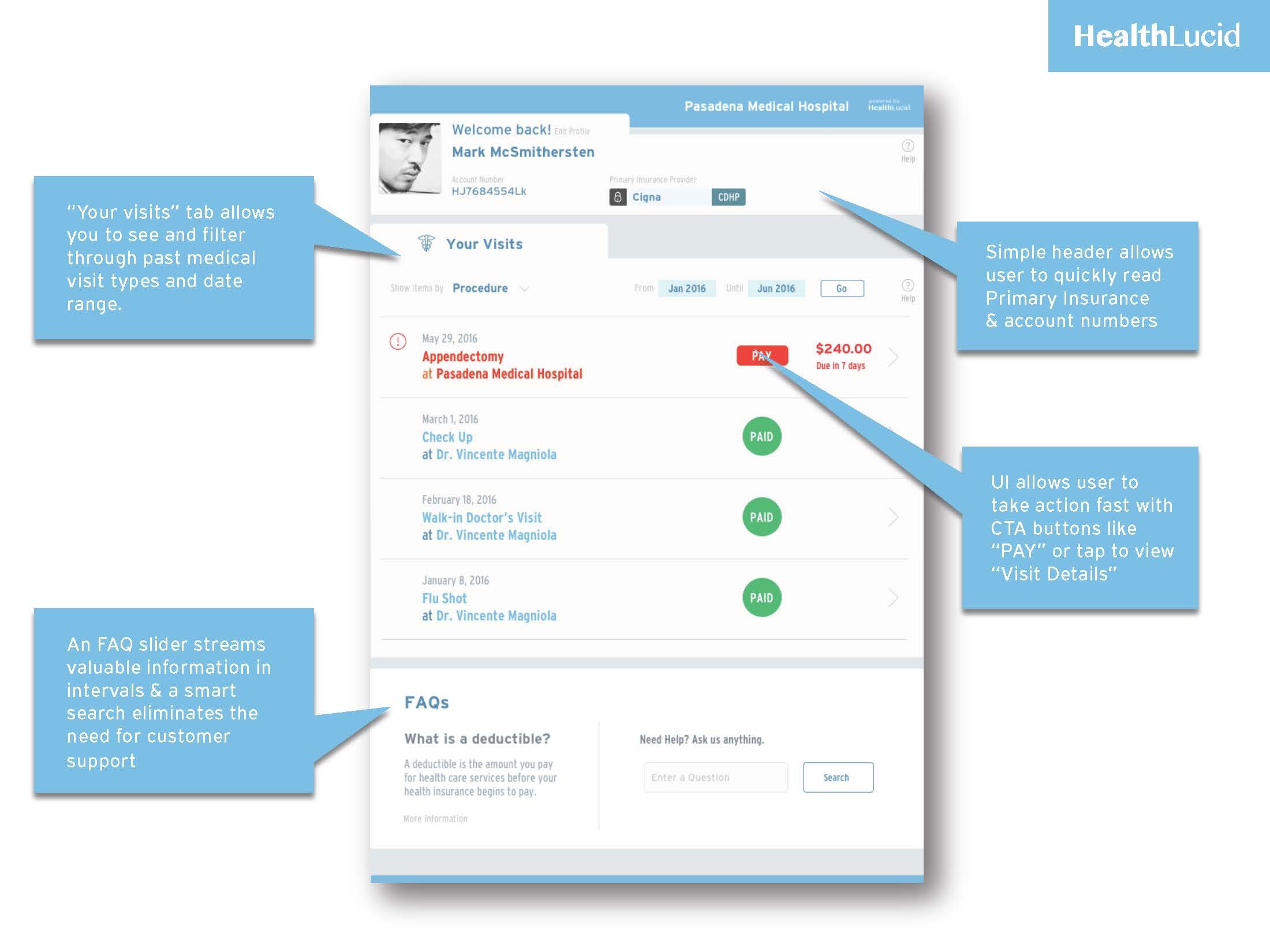
Consumer Dashboard

The goal for the consumer dashboard was to make comparing, and taking advantage of services/providers, and managing costs simpler. The mission was to educate and enable consumers to take charge of their healthcare options not just for themselves but all persons falling under their coverage.

W&H2-02.jpg

charitable luxury


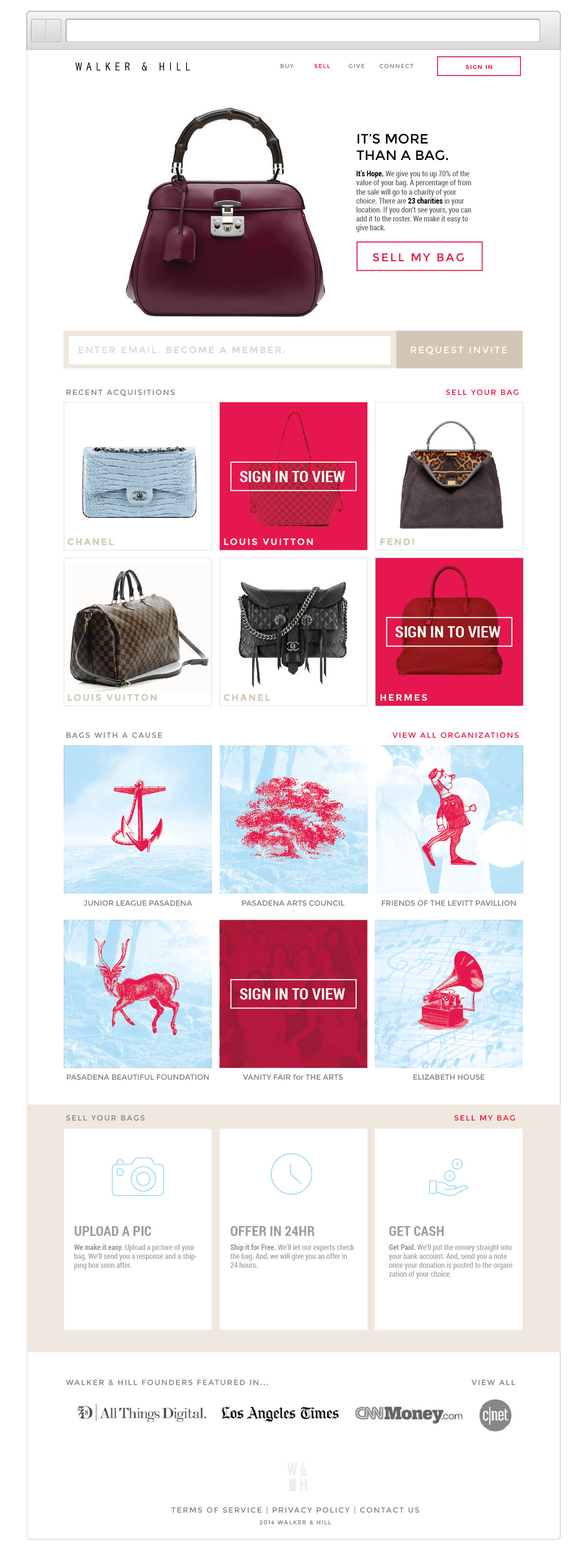
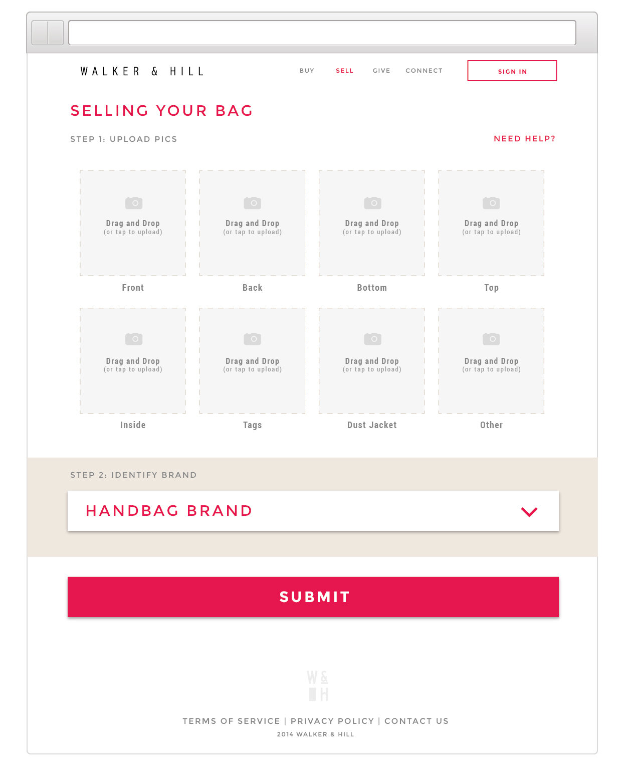
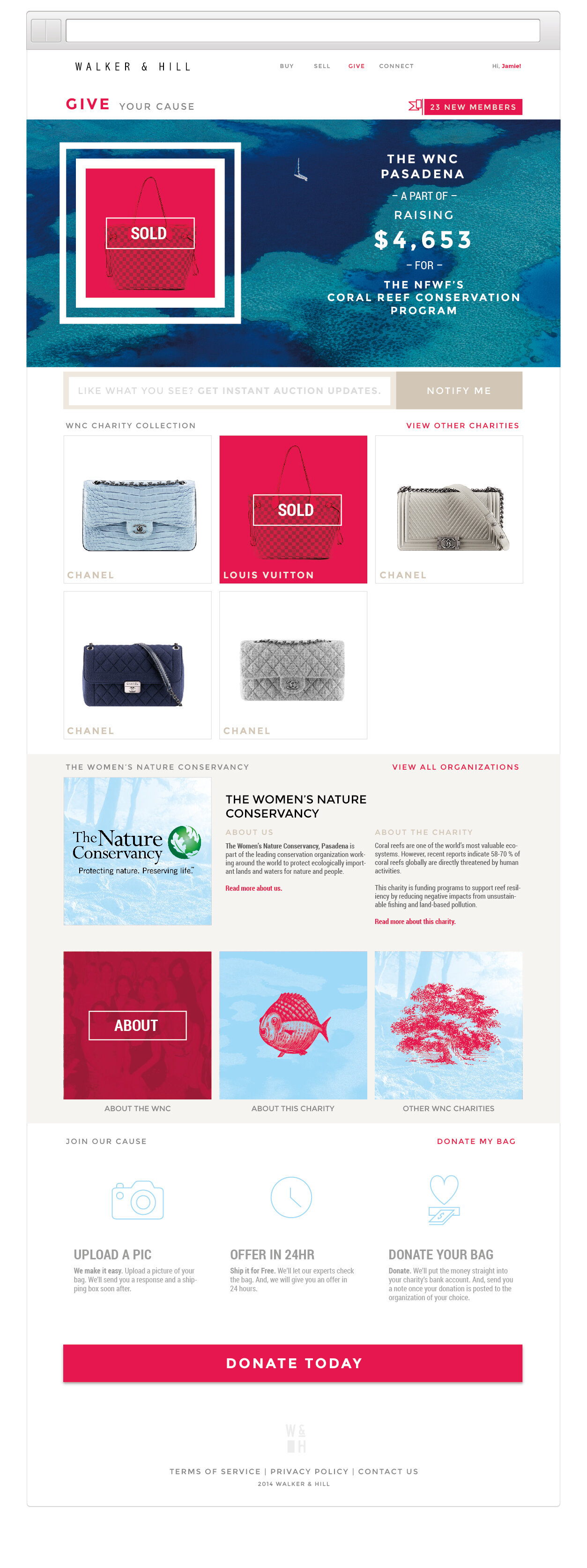
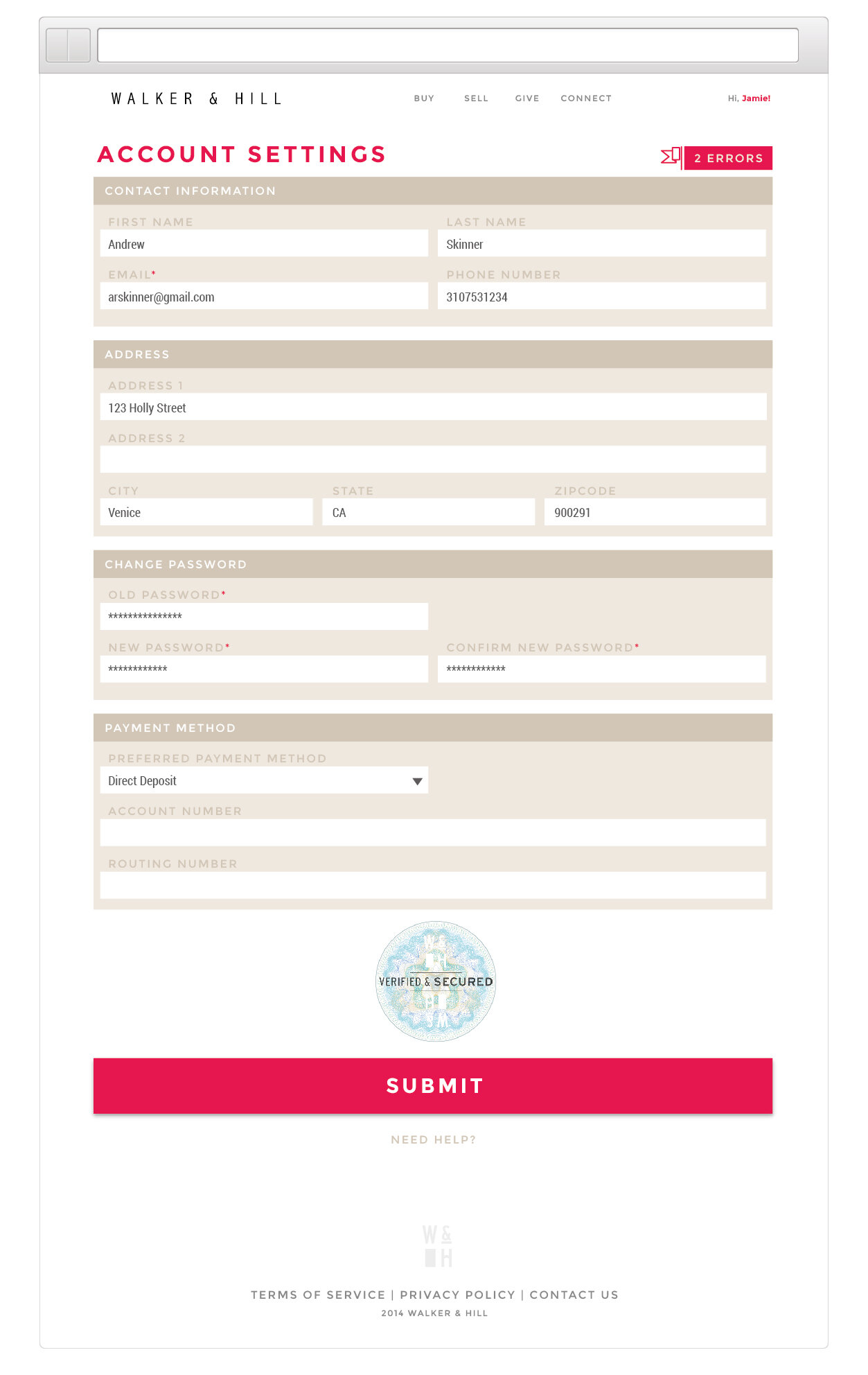
Walker & Hill is a luxury retail concept looking to reduce the impact throw away fashion has on the environment by offering a digital auctioning and authenticity verification platform for high-end accessories. Sales profit proceeds also benefit user selected charities. I worked on a small team on this short term project to develop concept Ui skins, UX and brand identity.


A drone app before there were drone apps


Fiat Volantes

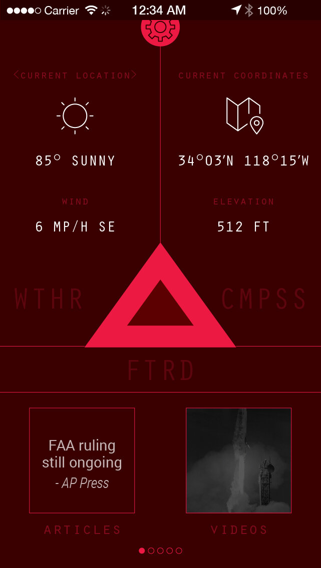
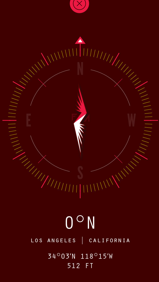
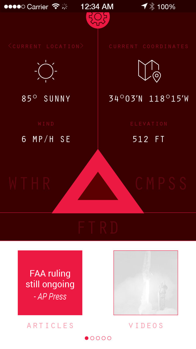
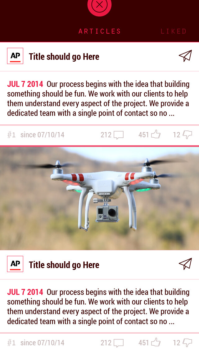
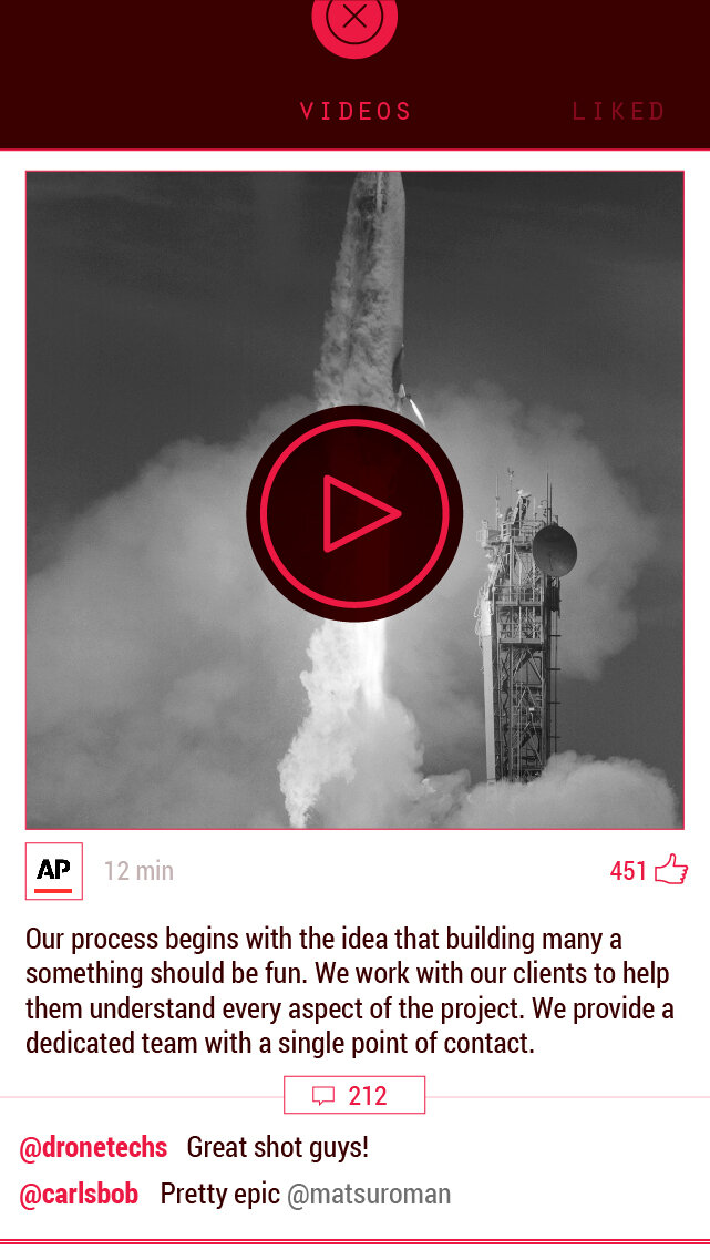
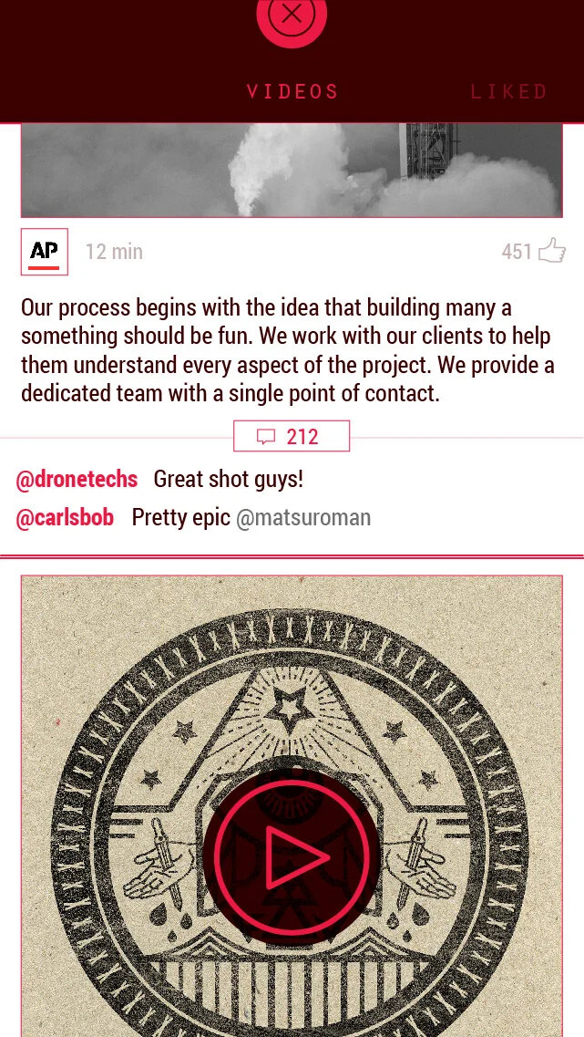
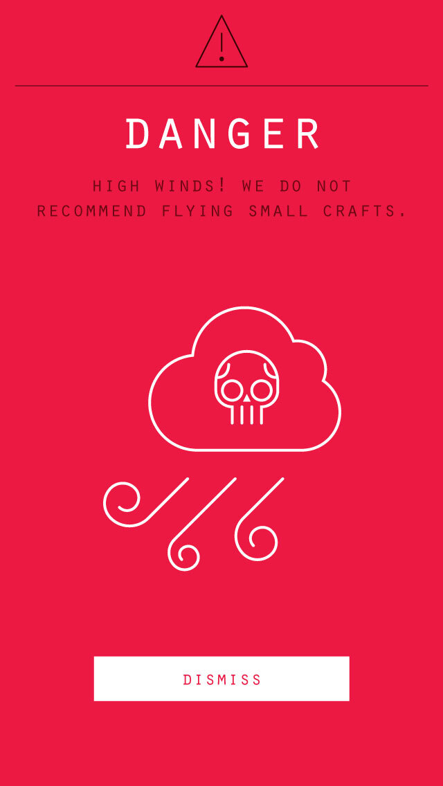
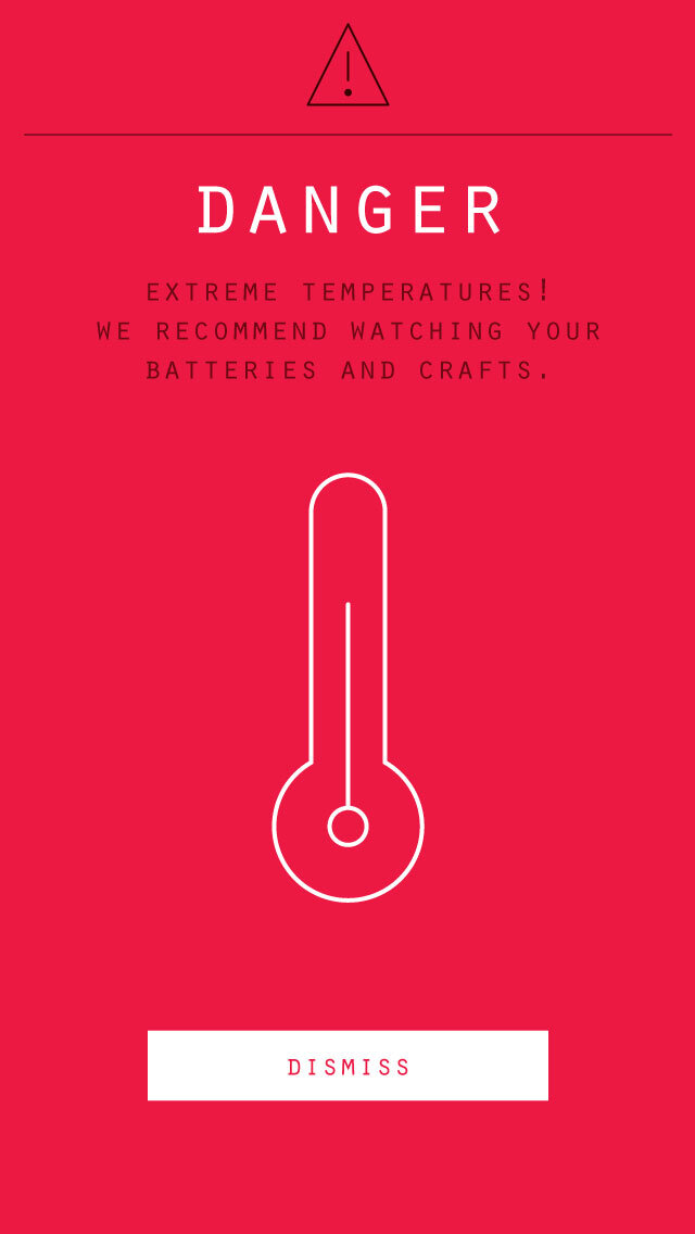
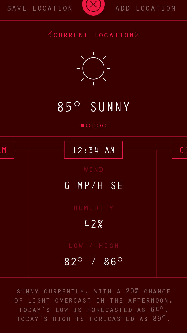
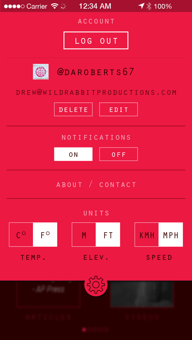
Fiat Volantes is a personal project dating back to 2014. I challenged myself to imagine an application targeted at the emerging drone community. The concept was to integrate media such as news updates, trending drone content and development, GPS coordinates, weather and wind alerts, as well as danger push notifications.

20160201fiat-volantes.jpg
20160201fv_intro.jpg